sourcing artwork

A recent commission to source original artwork for a client's Islington penthouse apartment.

Our client is a keen collector of Modern British artwork, and we have already worked together to find some really interesting pieces for another property, with a particular emphasis of female artists such as Elisabeth Blackadder and Sandra Blow, but this time they wanted to look for something more contemporary for this modern apartment.

The beautiful series of woodcuts 'Nachtfahrt' (or literally translated, Night Drive) by German artist Christiane Baumgartner immediately stood out for their beauty, originality and haunting narrative quality.


Triptychon

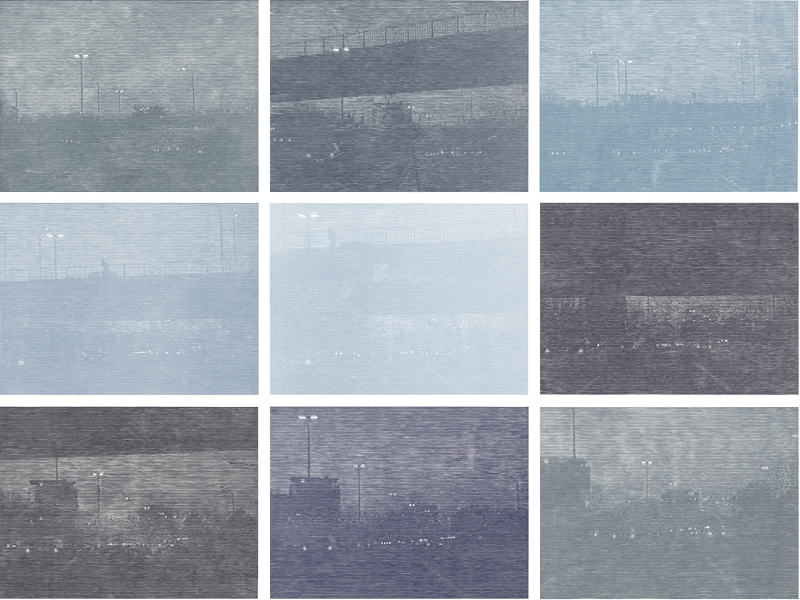
About the artist: Her chosen format is monumental monochrome woodcuts taken from her own video stills. She combines the earliest and the latest processes of visual reproduction: woodcut and video.
Speed and the passage of time are recurring themes throughout her work.The notion of time is also embodied in her artistic process, which involves the lengthy and painstaking medium of handmade woodcut, with all its inaccuracies and mistakes. Transforming the fleeting video stills into these confusingly complicated and delicately flickering woodcuts can take up to a year, and the results embody both this sense of the chance moment, and the solidity of crafted exactitude.

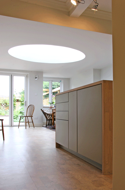
Whist the series works beautifully hung as a block (see above images from the artists website), we chose to hang them in a linear fashion around the room, which works to capture the video still nature, with the story being told sequentially, and the works travel towards and under a bridge for example revealing itself as you move around the space. The environment of the apartment itself, its linear architecture, and the light and views over the cityscape serve to highlight, converse with and contrast with the work.


More about Christiane Baumgartner from Alan Cristea gallery: "Christiane Baumgartner was born in 1967 in Leipzig, Germany,

contemporary kitchen in Georgian house

Georgian house: kitchen 

features: minimalist Leicht kitchen, jerusalem stone tiling, cork flooring, corian and soaped oak worktops, artemide lighting


Our client for this project had taken on a big challenge: to transform a quirky and landmark Georgian townhouse from its slightly tired state into a sensitively 'modern' home with enduring design qualities. Along with local architect Richard Twinch she undertook major restoration and renovation works, including building a ground floor extension with a fantastic oval light-well as shown below. We were commissioned to work on the kitchen and bathrooms, which were required to be high spec but understated and timeless.


Working with Martin Williamson from In-House Design, we designed a beautiful Leicht kitchen that makes use of all available space. The kitchen is subtle, minimal and practical; all distractions are removed with handle-free doors and built in or concealed appliances, lending it a feel more of furniture than many kitchens.
The doors are lacquered in soft matte olive and vanilla, with a cream corian worktop and built in appliances including a gaggenau extractor and Leicht induction hob. The kitchen opens up into the new extension space with its spectacular roof light, and double doors link through to the garden.


The island unit is designed as a stand alone piece of furniture, reminiscent of a  trunk or chest with its soaped oak wrap-around worktop and finger joints. 


The architectural lighting (fixed on what was once a support beam for a dentist's chair that was located in the room above) is a classic artemide design by Michele de Lucchi, and spots built in to the cupboards and shelves provide valuable task lightning. The pale laquered cork flooring compliments the soaped oak, and this other natural element ensures the space is warm with character despite its clean lines. 


The corian sink  is inconspicuously incorporated in the worktop

a new arts and crafts - a maple kitchen - north oxford house

North Oxford house with an arts and crafts twist        

Kitchen

hand made kitchen in maple with crafted panels, pre mural.

The Parktown area of Oxford is a famous landmark site and this project was sited within one of the crescents that exists. The house was built in the late 1850's and was designed by Samuel Lipscomb Seckham using bath stone as the main building material. He was a surveyor who was commissioned by St John's college to develop the area. Should you wish to visit you will see that It is very reminiscent of the famous crescent at Bath, and was no doubt designed to air a similar grand quality.

The project was to be the total revamp of one of the houses in the crescent (in stages), and as such the owners had decided to commission us to 'lift its spirit'. This project was a total pleasure in many ways, as we both loved the house and its character. The house is set out over 5 floors, the piano nobile with the drawing room and dining rooms on the 1st floor with views over the Parktown gardens. Initially there was not a great deal of harmony in the house (design-wise) as it was split into several separate apartments at some point in its near history. This then meant having a total vision for the place, whilst staging the works and bringing the different spaces together again. Whilst first impressions of the house in this state would to many dictate a total 'rip out' and refurbishment, we felt, with the support of our clients, that a restoration approach could achieve more and retain the character of the property. Restoration is a gentler, but more intricate, complicated and sometimes time consuming project, but the end result is so much subtler and kinder to the house that we believe it is well worth it. It seems a shame for example to replace a lathe and plaster wall with modern plasterboard just because it is flatter - after all, the character of an old house is in the quirks (and ripping out old lathes always makes we think of the person who whittled each piece of timber individually).

Whist full of character, the house had been badly mistreated in some ways, and many of the period features were somewhat obscured. Its most notable features were the beautiful handrail that trailed throughout the floors; the tall glazed internal doors; the high ceilings with original cornice and the fireplace in the ground floor living space. The main carrera marble fireplace housed decorative Duncan Grant tiles and it was this detail that gifted us the idea of using art and craft to give the house an artisan feel, that it possibly once had. We wanted to take the core concepts of arts and crafts, but tweak and modernise, and see if the ethos and character could also work within a contemporary and modern sleekness. 

Many of the items that you will see throughout are either one-off or unique in someway. So, while we adapted some of the arts and crafts designs, we weren't faithful to them. In fact we gave the designs a modern twist, something that would sit alongside individual modern items and not look out of place.

It is a house like no other and so for inspiration we decided to visit Blackwell House, an arts and crafts exhibition house, situated in the Lake District, which houses a wonderful collection of relevant pieces. William de Morgan tiles adorn the fireplace surrounds in the large house. Also on show in the exhibition at the time, were lots of ceramic work. The hallmark of the arts and crafts period was the level of embelishment. Nothing was left blank and ordinary if at all possible. 


At the time of investigating where we should place our design, we came across an artisanal nature to the craft industry in Holland and in the UK.  Leading designers like Hella Jongherius, were bringing their passion for 'handmade' skills within modern production methods to the table. 

cowparsley splashback with led lighting


So it became quite clear, that within the make over, it wouldn't be out of place to acquire craft from other sources to sit alongside our own brand of arts and craft informed designs, and link through for a very unique experience.

initial design concepts

initial design concept 2 (island unit)
.

The project began at the deep end with the transformation of the kitchen and ground floor lounge area that ran into each other separated by 2.8m high glass double doors.

kitchen; The main features are the maple worktops,

a north oxford house


Drawing room and dining room >


In this drawing room (a proper, first floor affair) light and the huge windows are all. We wanted to create a design that played with formal traditional drawing room style, and messed about with it, adding colour and fun. A huge element of the room is the floor to ceiling shelving structure, which is constructed from ash with an ebonised hardwood that delineates and configures the structure. This was designed to house various elements including books, objects, TV and media and a stereo with space for cd's. This was a one-off item which we created for the client. It holds your attention and commands the space that it lies in. There is an almost art deco feel to it, with the dark and light woods and polished finish.


detail of shelving
The sofas were sourced from Fran at Liscious Interiors, and re-upholstered in striking fabrics in soft brushes cotton. The colours reflected the dining space but lifted and lightened. The Chesterfield grey sofa has a purple running through it and we applied very bright violet buttons to the piece and dressed with lime accents. The lime - or chartreuse - Chesterfield was very simply dressed and as such we reversed the colour works and had predominantly purple striped cushions in a deep velvet. 

A small day bed wrapped in a defined purple inhabits a space close to the book shelves and near to the distinctive sash windows.


A  balance between privacy and letting the light through was achieved by way of full length linen curtains with a silk floral motif running through, and a sheer roman blind that drops down (colourfully) to frost out the background, again in natural linen but with colourful stripes.


We strongly felt that this huge space did not need a central ceiling light, but to light the space with

victorian terrace: funky lounge and a dj room


walnut alcove shelving and cast concrete fireplace
Yr: 2003+/-

The lounge that was created, presented a warm front that included the brown tan leather sofas and one-off walnut alcove units that flanked the chimney breast. There was also a cvo firevault fire.
The fireplace as part of the one-off aspect that we like to throw into our projects was designed and created by rogue-designs.  It's made from concrete, parts of which were cast in-situ. It appears to float due to the shadow detail that we applied to it.

The walnut floor is a feature to the whole of the ground floor - approximately 96sqm. 

The vintage lighting again, was sourced through a supplier in London. 

The image above the fireplace was from a collage that i made and had blown up onto a foam panel. 


The space known as the DJ room, is situated between the kitchen and the lounge. The room housed the owners record collection. A functioning glitter ball was also attached to the ceiling. A discreet spotlight activated the spinning ball when switched on.  

No speaker cable was visible due in part to it all being housed behind the skirting boards. speaker points were then dotted around for increased flexibility. 

The dj console was created by rogue-designs, especially to house the dj decks with a space under for other electronic equipment. It was sprayed in a gloss lipstick red. As it was a feature to the space it warranted a stand alone quality.


bespoke dj deck

functionality and colour in a kitchen - grandpont house


Victorian House: 

features: Lacanche gas oven, Island unit, slate grey porcelain tiles, lime green, oak lantern, Blanco inset sink.


This project was the second of 3 commissions by our client, after working with them on the design of loft with on-suite, and then later their garden.

This began life pre-extension and the remit was to design a kitchen that was highly functional and host various items like a large and rather special eurocave wine fridge (see photo) and also a smaller wine unit to be housed in the island unit. The list of appliances continued; there was the Lacanche range; a multi ring gas burner that was to stand centre stage in the kitchen. The owner being a very interested and extremely capable chef insisted upon this furniture, and why not! The extension was cleverly designed by architect Tony Reedman, making much of a slightly awkward space. The extension was carried out to a very good standard and so made the process of designing for the space much easier than it could have been. It is imperative that your builder is accommodating at this stage as various items will impact on the final design. Whilst some features had to be altered i.e.size of steel beams holding up the house, most of the structure and size was kept within targets. Working with an experienced design team at In House, we organised a design that fitted the needs of the client and made sense of the space: ample room for cooking, room for art on walls and a place where this family could be seated in an evening or entertain.


Kitchens are notoriously difficult to organise and generally work around very clear principles. However, every space is different and can ask different questions of the designer.

contemporary garden design

Every once in a while we like to get outside for some fresh air, and make a garden. 


soft grasses, hard landscaping and plenty of structure:


a luxurious bathroom - victorian house


The owners had recently moved into the house and required it to be modernised throughout. 


Many of our customers enjoy the need for the works to be staged, rather than to be carried out all at once. This affords them the ability to assess the scheme and its direction without being bombarded with a great many decisions all at once.  


The starting point of this particular project was to be one of the main bathrooms and culminated in the overhaul of the 25m garden area, completed on the back of a special extension.


1st stage: master bathroom.


palette: > thin strip oak, lemon marble tiles, mirror, flint grey.


This is a great space for relaxing, that's set in the heart of the top floor, between 2 bedrooms. The room doesn't have a window, however it makes up for the lack of natural light by using light and reflection.  There is a spectacular floor-to-ceiling marble wall with

Smallest rooms


The Joy of small rooms !

This was a recently completed room. Although very small it works tremendously well. The whole design was tailored around creating a very modern feel but with a nod to the buildings victorian build. The room now has an updated charm and function that sits well within its context. At just under 90cm wide and at 3metres in length the room was as per its counterpart room above, very tight and awkward with victorian render that was somewhat rough. Formalising this for the 21st century was not without its hitches. prior to our intervention there featured a sink that was set into the wall, which created a large absence when taken out. The pipework that ran under the floor was actually supporting the old flooring at certain points. Yet these were surmountable.

Overall scheme with rich colours clean lines and good function

Dornbracht IMO' tap
The cupboard that hangs above the sink was a 'one-off' with sliding runners

light and open kitchen - victorian terrace

living etc front cover rogue-designs


This particular project features on our main web site. However I thought I would share more photos with you.  The project itself featured in Living etc magazine (front cover no less) and also featured as one of their 50 best for that year. 

The whole of the interior was knocked through and opened up to maximise the level of light penetration from the back of the house.

The kitchen boasted 40mm walnut worktops that wrapped around 3 sides and at the end had a small breakfast bar area. Along the main wall through to the dining space there was another bank of units that carried a greater amount of space for food storage and prep.  The inset sinks add to the designs less cluttered aspect. Walnut insets were created to sit over the sink when not in use.


The walls were very exciting and somewhat experimental. They are of a concrete render which had black volcanic glass granules thrown at it in the last stages of its preparation. The whole thing then rubbed up and when dry, rubbed back slightly to reveal the penetrated glass. 

The lighting in the dining space in image 4 was sourced from a london antique centre that specialised in italian mid century lighting design.

The dining space also had space for an bubble chair to be secured to one of the main roof supports.


Bubble Chair by Eero Aarnio


kitchen in use


Its lovely to see one of our kitchens in use. And to see the difference by evening. I snapped these pictures at a recent supper. And very delicious it was too, thankyou!


to see this during the day, look at this post: grandpont house

colourful tiles- a North Oxford house: Living room

We worked in this area along side the kitchen (see north oxford house: kitchen) area.

It is a wonderful room with lovely aspects to all sides; the double doors linking to the kitchen, a beautiful fireplace, huge windows to one wall and double glass doors to the front garden. There are privacy shutters and the light enters the room in really pleasurable way. 

lounge view with duncan grant tiles set into the fireplace

It was very exciting to continue with the themes that we set up in the kitchen and utilise them in a different way. This project was all about a modern take on the arts and crafts movement; taking traditional ideas about handcrafting and applying modern techniques and designs. We attempted to make no single item stand out, but make sure that alll the items within had uniqueness. The flooring from kitchen continued with white oil wax throughout. The application of the oil wax is a very time consuming process that requires a lot of attention and many layers are required over virgin wood. At the heart of the room is the 'Arne' sofa by BB Italia, its almost 3m long and strikingly curved. We didn't want the formality of the kitchen area to impede and direct the shape and function of the lounge and so to break free from the restraints of linear sofas (which tend to inhabit the area along a wall!) we plumped for this sofa with its gentle curves and low profile, so as not to restrict the views outside. The fireplace has vibrant hand-painted Duncan Grant tiles set in - an interesting and quirky contrast of highly traditional grand carrera marble and rustic art and crafts most likely dating from the early '20s and injecting a little bit of Charleston to the house. Around the fireplace - we constructed units that have carved panels for frontage. The images I conceived as small narratives, where nature and industry are intermingled in some way. A bird flys by electrical wires or a tree grows up through a broken, abandoned chair. The units were sprayed green to co-incide with the kitchen colours, both symbolise the power of nature to overcome industrial adversity.

In front of the sofa; a wonderful commissioned piece by Amy Kent. A handmade rug designed around lines and shadows in pavements.


the lefthand unit; 'silver birch'

sparrow about to land (detail)